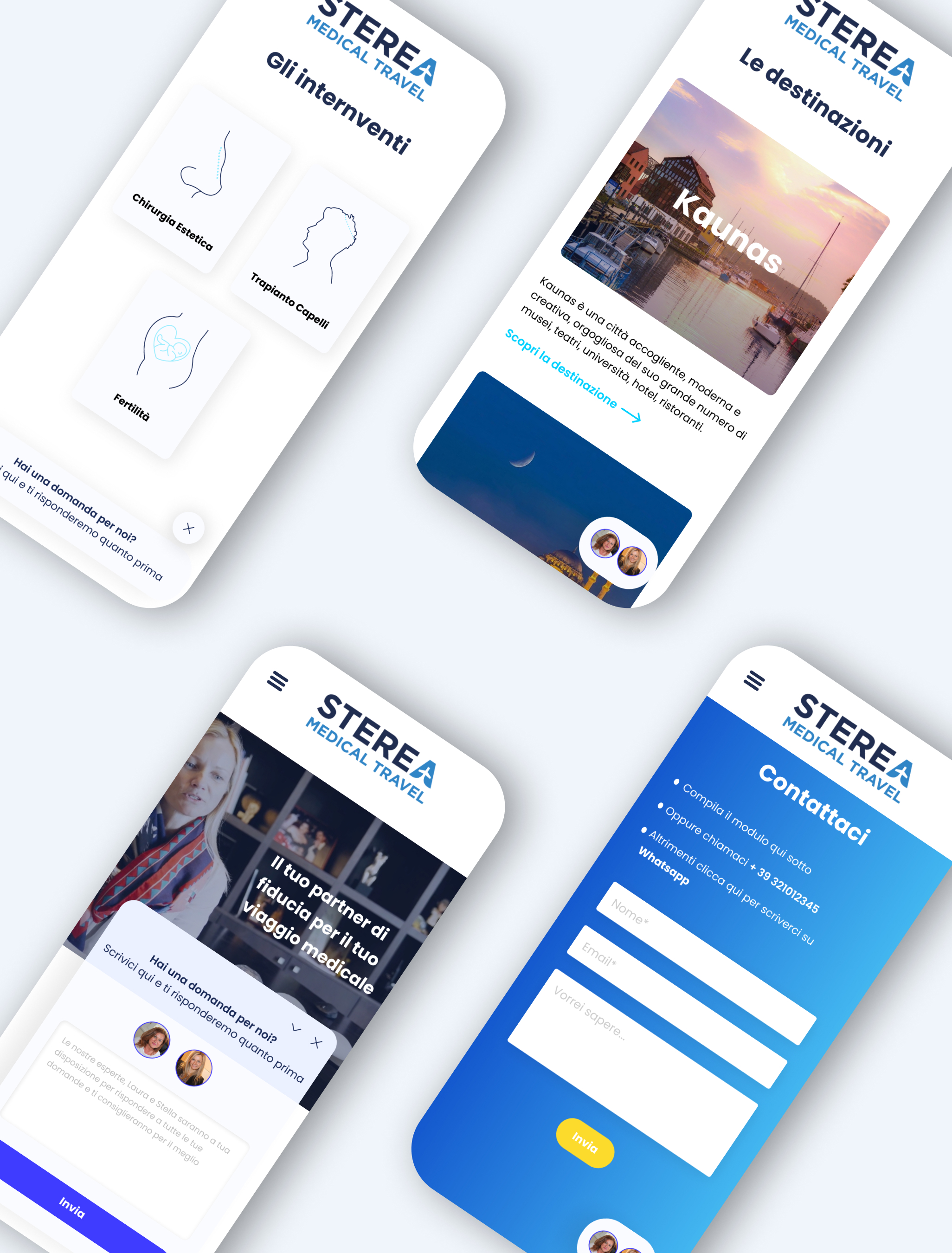
Name & description
Sterea Medical Travel - an Italian-Lithuanian company offering medical tourism solutions to the Italian market
Project type
Website (freelance work)
Challenges
- Renew the business’ online presence
- Create a trustworthy, appealing and converting experience starting from a partially established brand identity
- Design, from scratch, the functionality and visual appearance of the website’s new chat solution
Results
An engaging, intuitive and sales-driving website catering to the business’ market and target audience needs and expectations
My role
UI & UX Designer
The primary goals for this website included:
- Intuitively steer potential clients towards navigating the whole website to find the information they need, leading to them getting in touch with the business
- Immediately clarify doubts and questions potential clients might have
- Having efficient and user-oriented means of reaching out to the business, also via the new chat solution


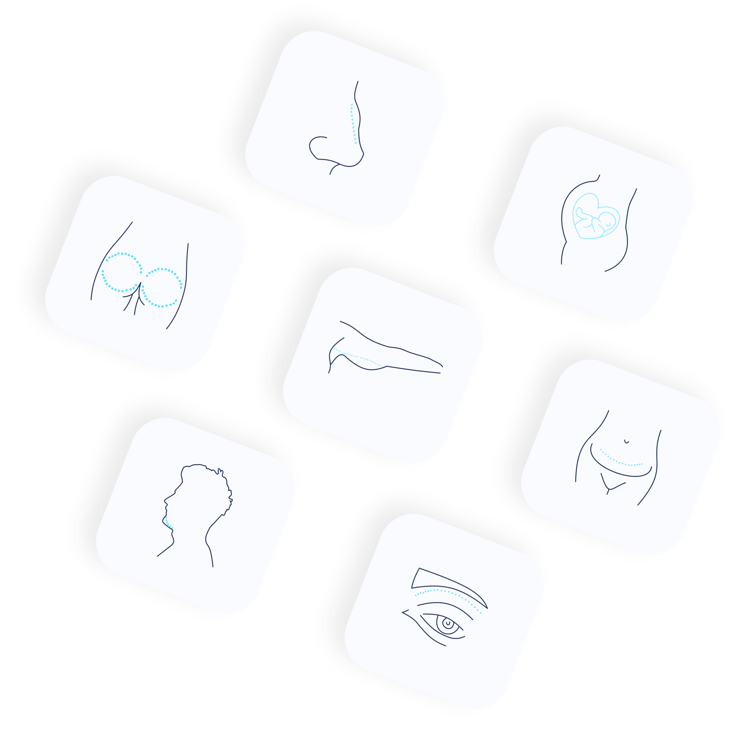
For this project I also created some minimal illustrations. They have two main purposes:
- Informative. They are meant to clarify where in the body the surgery/procedure takes place
- Calming. Their friendly and stylized look is meant to mitigate negative feelings towards the procedures
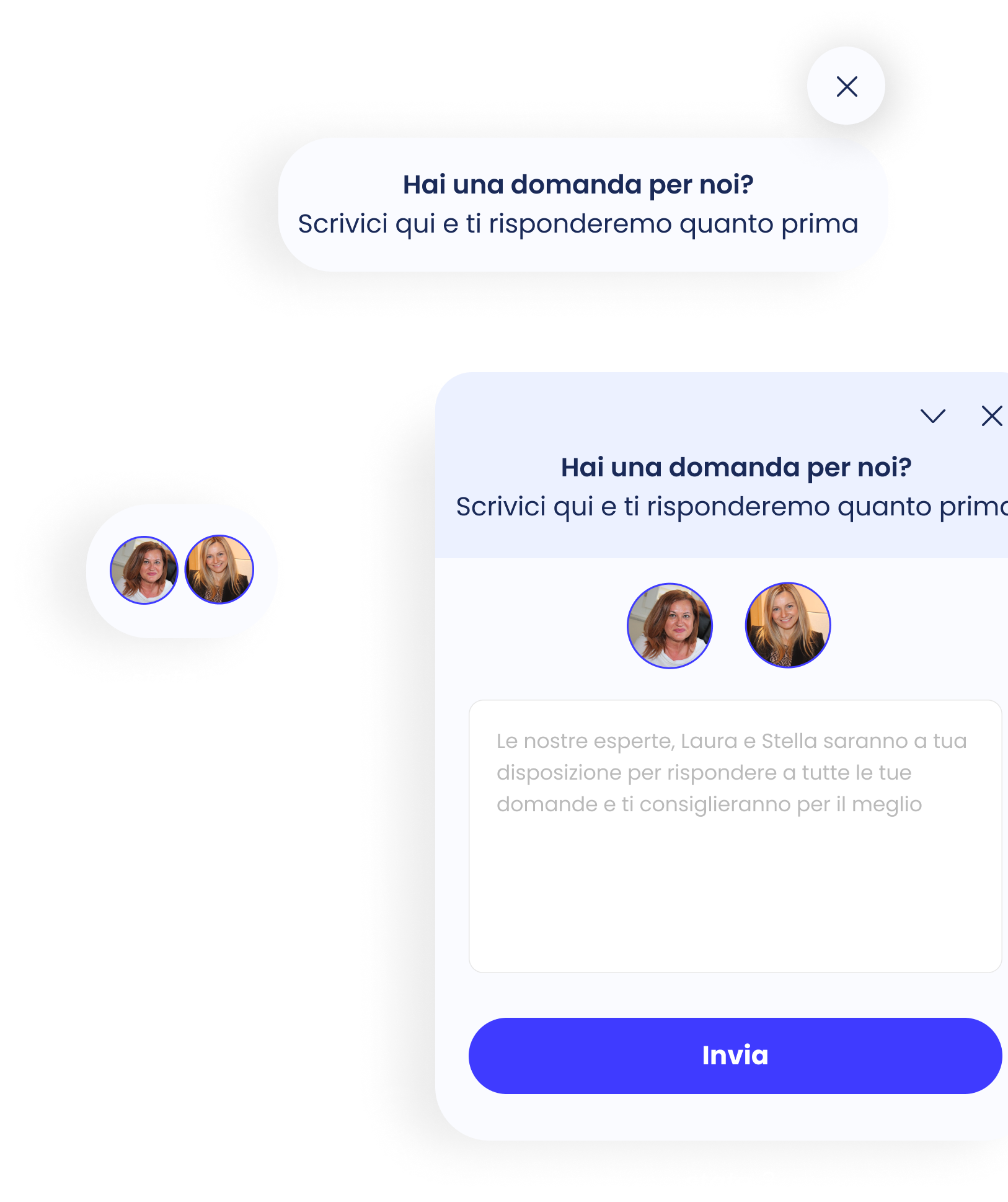
Sterea’s dynamic messaging app
Sterea’s old website provided very few entry points for potential clients to get in touch and engage with the business. Improving this aspect became a top priority to maximize conversions.
In addition to placing more contact forms throughout the website, I added a dynamic messaging app into the mix. This would be present throughout the whole website providing users with a constant point of contact between them and the business.
With the intent of improving the UX even further, the messaging app changes dynamically based on what content the user is viewing. For example, depending on which procedure the user is browsing, the content shown in the chat updates accordingly: if the user is in the cosmetic surgery section, the content changes from the generic “Have any questions for us?” to “Are you considering a cosmetic surgery procedure?”. The goal is to convey to potential clients that they are not alone and they are constantly cared for in their journey through the website and their decision making process. This addition has improved website conversions.
